Adding business context to multi-step customer transactions
A truly mature observability practice goes beyond basic log ingestion and monitoring. What we monitor becomes more meaningful and actionable when we apply the business context. Analysts need to understand where to apply their analysis in order to create prescriptive solutions.
That's where Splunk AppDynamics can really help. By providing the tools needed to optimize (done with Experience Journey Maps) and to transform (by creating Business Journeys), you allow for predictive performance improvements.
Data required
- Data from any industry (financial, retail, etc)
How to use Splunk software for this use case
Experience Journey Maps
Optimization is about the performance of sequential steps in a user journey. Are you users able to quickly and reliably get from point A to B to C? Is your new app version or third-party resource going to impact you end users completing their tasks? Are your clients having problems - either server side or client side? Let's use Splunk AppDynamics to find out.
The Browser App Dashboard is a monitoring tool that helps you see key data points about your users aggregated into a time frame that you select.

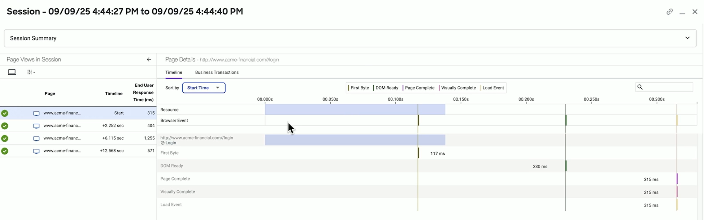
The dashboard is useful, but an individual experience can tell more of a journey. Click Sessions.

Then select a user to see information, such as loading times for each page the user visited. Using the session ID, you can follow the user through every action they took to get a full picture of their experience.
For aggregate information over time to see trends, the Experience Journey Map (on-premises or SaaS) shows how the overall group of users did through the intended journey of an application. In this example, for financial services, we're following both people who applied for loans and people who were trading stock. We can see the drop off rate at each step of the process. You can create this type of journey for any process in your organization.

You can also open each stage of the journey to see what people tried to do, and to figure out where and why they dropped off, as well as what errors in the process might exist.

Business Journeys
Transformation requires providing key business analytics to your executives. This might include conversion rates and trends, churn rates, internal process completion, and lots more key metrics, depending on your industry. These data points must be delivered through good executive reporting that tells a story, rather than merely providing metrics.
As with the Experience Journey Map, you can start with simple dashboards and reports of metrics that interest you. However, you can also incorporate a journey into a dashboard, as you see in the Loan Dropoff panel below.

Business Journeys (on-premises or SaaS) show milestones in a business activity. They show the drop off at each stage, the time it takes between each, and health scores for each milestone.

Business Journeys generate a data schema of individual metrics that you can run searches against to get as granular data as you want on individual experiences.

You can also turn those metrics into visualizations that you can segment in any number of ways (city, loan type, etc) for even more business context.

Next steps
Now that you have an idea of how Splunk AppDynamics can help you bring context to your monitoring activities, watch the full .Conf25 Talk, A Long Day's Journey into Apps: Following what Matters with AppDynamics. In the talk, you'll also learn how Splunk AppDynamics helps you troubleshoot, and you can watch demos of multiple troubleshooting scenarios.
In addition, you might find these Splunk resources helpful:
- Splunk Lantern Article: Troubleshooting critical application performance issues