Managing data limits in Splunk Observability Cloud
A metric time series (MTS) contains all the data points that have the same metric name, metric type, and set of dimensions. Splunk Observability Cloud automatically creates MTS from incoming data points. Metrics are displayed in charts or detectors through data() blocks, each one being represented by a row. In this first example, you can see two data() blocks in the chart, row A and row B.

In this second example, you can see one data() block, row A, in a detector.

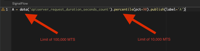
These data() blocks are created on the backend with a SignalFlow. In this example, A = data('cpu.utilization') is the data() block and publish(label='A') is the instruction to display it on the dashboard.

All of these blocks have limits. When you reach a limit, the code will still run, but it will display an incomplete data set, which means you will have incorrect results. Most Splunk Observability Cloud customers start with a 30k data limit, but increasing it to 100k is very common.
To learn more about limits, see Per product system limits in Splunk Observability Cloud.
However, some functions have their own limits. In the example below, the data() block limit is increased to 100,000 MTS, but then paired with the percentile() function, which has a limit of 10,000. This means that the data will be limited by the function.
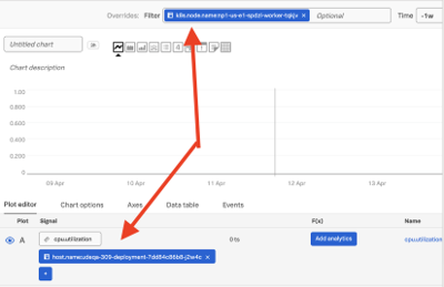
There are also other limits, such as a maximum of 1,000 MTS that can be displayed on a chart or exported through CSV. These limits on functions, dashboards, and charts can only be managed through user education. For example, the Splunk Observability Cloud UI displays several warnings when you reach the limit, as shown in the following screenshots.


This article focuses on actions you can take to avoid reaching MTS limits and ensure that you have access to complete data sets.
How to use Splunk software for this use case
Dashboards
Use filters
Filters prevent Splunk Observability Cloud from pulling as many MTS from the backend. Additionally, because your deployment will process less data, your queries will run faster. You can add filters at the dashboard level or write them into the queries.
Split queries into different panels
By constructing dashboards with more granular panels for different types of data, you force filters, which applies the benefits described above. A trade off with this approach is that you might end up with too many panels in a dashboard. This can make your dashboard harder to interpret and update.
This example splits the data between between production and non-production.

Split queries in different rows
Putting multiple queries in a single panel but splitting them into different rows is easier to manage than splitting queries into different panels. However, each chart is limited to 250,000 MTS, so too many queries might exceed that.

Use a NOT operator as a catch-all to avoid manually typing all the possible filters and to future-proof when onboarding new datasets. For example, you might have one row called "Production" and the other "Not Production" so if a new environment is added later, it is captured automatically.
Use partition filters
- Before partitioning, we hit the limit.

- Avoid the limit with partition_filter(). In the example below, 26 partitions have been created, with a sum function at the end. However, dashboards have a limit of 250k MTS. So after 25 partitions, you can't get more results even with partitioning.

Ingestion
Use metrics pipeline management
Metrics pipeline management allows you to aggregate, drop, or archive metrics before ingestion. Aggregating can be very helpful. For example, you might want to look at the network throughput of an application, and you aren't concerned with the individual pods or containers. Aggregating gives you a view of the whole environment and an aggregated metric is highly unlikely to reach a limit.
However, a potential problem with this method is that the timestamp of the metrics will be replaced with ingest time. This can cause problems in some scenarios because of latency, and some metrics might arrive out of order, giving you inaccurate data.
Analytics
Enable the die-fast setting
An active MTS is one that has sent a data point in the last 36 hours. After that point, it becomes inactive. If you have a time filter set to display only the last 15 minutes, it's still searching anything that was active in the last 36 hours.
You can open a support ticket to use the die-fast flag to set metrics to inactive after only one hour. This is useful for short-lived MTS, and is even enabled by default for some metrics, like Kubernetes.
Use Python or another programming language
Query the API with a loop or recursive function and then process the data locally. Then you can send the summarized metrics back to Splunk Observability Cloud or to a spreadsheet for uploading into other software. However, it can take many hours to write such a script and also many hours to maintain it.
Therefore, this is an option of last resort. Remember that Splunk Observability Cloud is not a reporting tool; that is the function of Splunk Cloud Platform. If you try to use Splunk Observability Cloud for reporting, you will quickly reach limits. It's better to use Splunk Cloud Platform.
Additional resources
Now that you know how to manage data limits in Splunk Observability Cloud, you might be interested in learning how to manage other limits in the platform. In addition, these resources might help you implement the guidance found in this article:
- Splunk Help: Filter settings for all charts in a dashboard
- Splunk Help: Introduction to metrics pipeline management
- Splunk Help: Per product system limits in Splunk Observability Cloud